So I've had a crazy week in terms of work and late nights. Side story: My parents think it's shameful to sleep passed 8:30 even on the weekend. If I had been in a concentration camp and I had been forced to not sleep as part of my torture, this would go right over my parents heads. Well at least they've softened a bit in the last few years. So when I was going to bed the other morning I left a note in the kitchen so they wouldn't try and wake me up or make me feel like my life is a disgrace when I did wake up. Looks like the message got through.
Seem's like a slight pun encouraging me to continue catching Z's. Didn't matter though. Still woke up at 9. Old shaming habits die hard.
Friday, 23 September 2011
Friday, 16 September 2011
Tuesday, 13 September 2011
Monday, 12 September 2011
Karl's Kell 2 Kill'd
The Jon Voight phone is no more. Well in 30 days. Been trying to kill off this branch of the lying and deceptive Solo Mobile tree for the last little while. Love when you are committed to ending something but the customer service person thinks you are haggling and wont take no for an answer by offering deal after deal. Sharp contrast from a couple of months ago when I found out Solo was billing me for a number associated with a phone I didn't even have anymore. I told them I was leaving to try and get a deal or some money back and they basically were saying "Ya right!" with their so called Sorries.
Anyway doesn't matter since the multi-headed monster always wins out in the end.
Thursday, 8 September 2011
Behind Enemy Lines
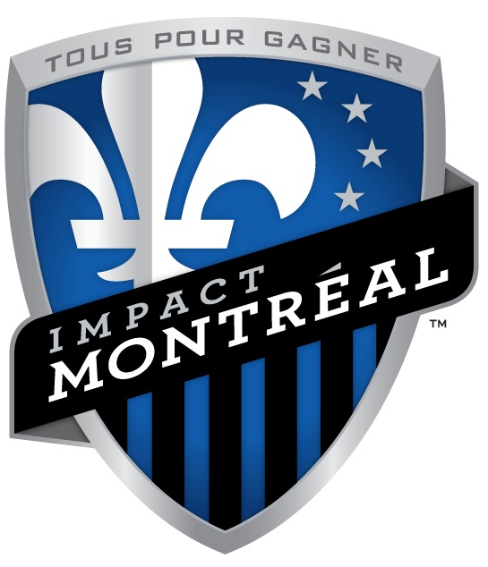
This is a little late as a post. Anyway, I was collaborating with the enemy a couple of months ago. I was mucking around and playing with the Impact logo and sent them my version before they released their own. I was using the new logos of Juventus and Shakhtar as inspirado since I like the clean modern look they both possess.
I didn't really have specific symbolism to work with as their wasn't any in their old logo other then their Nascar fleur de lis and the colour blue.
Here is the evolution of the Logo as it appears in my mind.
I didn't really have specific symbolism to work with as their wasn't any in their old logo other then their Nascar fleur de lis and the colour blue.
Here is the evolution of the Logo as it appears in my mind.
Their New One
My Version (One of a couple colour combos)
Their old "90's style" logo
C'est la vie!
Monday, 5 September 2011
Crest of the Moon...and the Sun
Nuts to Family Crests. Here's is the first part in what may be a series of my Individual Crests. Thanks for being my first royal subject Ned. And yes that is the Guelph crown.
Subscribe to:
Comments (Atom)


