Thursday, 30 June 2011
Monday, 27 June 2011
Great Goal to Everyone Except 'Arry Redknapp
Worst manager in the world could have a Barcelona like team and still not know how to bring up his players or rotate his squad. I take a lot of joy out of seeing a player that he has frozen out come back to show him up.
Funny thing is if he didn't already have Gio on his squadlist he'd be trying to waste a crap load to get him. He's just weird that way.
Saturday, 25 June 2011
Lightning Simplified
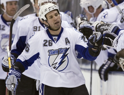
Looks like the Tampa Bay Lightning simplified their logo and their jersey. Something I always thought they should've done. Hated the last one, because it was unnecessarily busy. I like the fact that these are simple and to the point. Two toned (I would have maybe retained the black as well). No stupid 3rd dimension to the lightning bolt or a thick outline to overly complicate the logo. Like how their home jerseys have no wordmark on the home jerseys. If anyone disagrees with me you are an idiot. I think Yzerman was the brains behind this operation.
New:
Old:
Proof that Message Boards and Comment Sections have
handed the world over to the Idiots on this subject:
- AC says:Looks clean, but the lightning logo looks like a 6 year old drew it!
- Gord says:Not a fan at all. I actually kinda liked their old digs
- bert c says:Yeah they are to plain, should kee the same ones if you ask me…that or come up with a new logo.
Proof that there is at least one level headed individual out there:
- Bugs says:I gotta say, from a Hab perspective, that’s a very nice logo. Simple classic elegant design.
Well done.
Friday, 24 June 2011
Subscribe to:
Comments (Atom)


